
Solarisca - Branding for a Food Tour Agency
Solarisca offers immersive food tours through Portugal’s coastal villages, bringing travelers closer to local traditions, flavors, craftsmanship, and heritage.
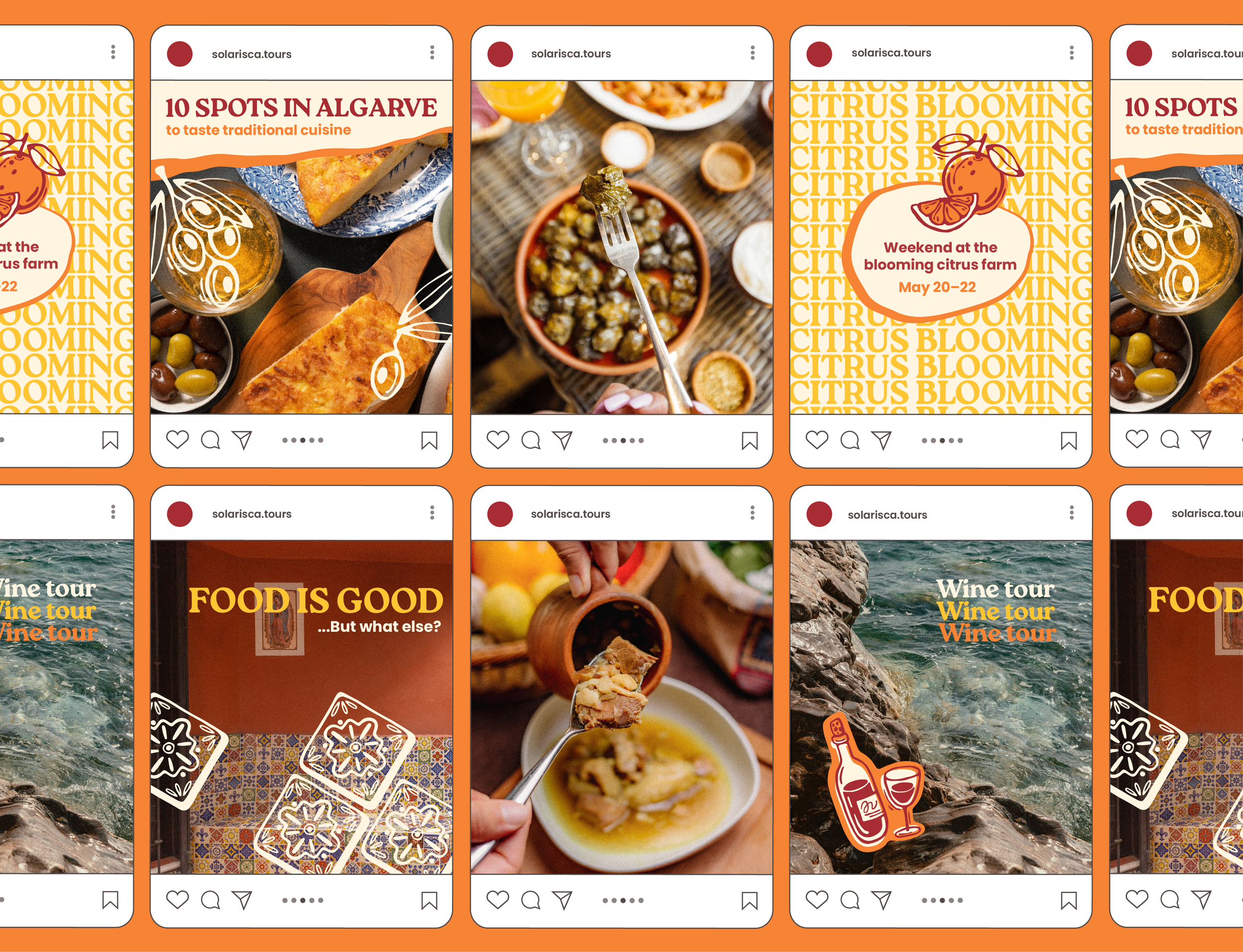
The client wanted a branding system that feels warm and authentic while being versatile for merchandise, a typography solution that’s intuitive for social media and the website, and a fresh color palette that moves beyond the typical blue-and-white associated with Portugal
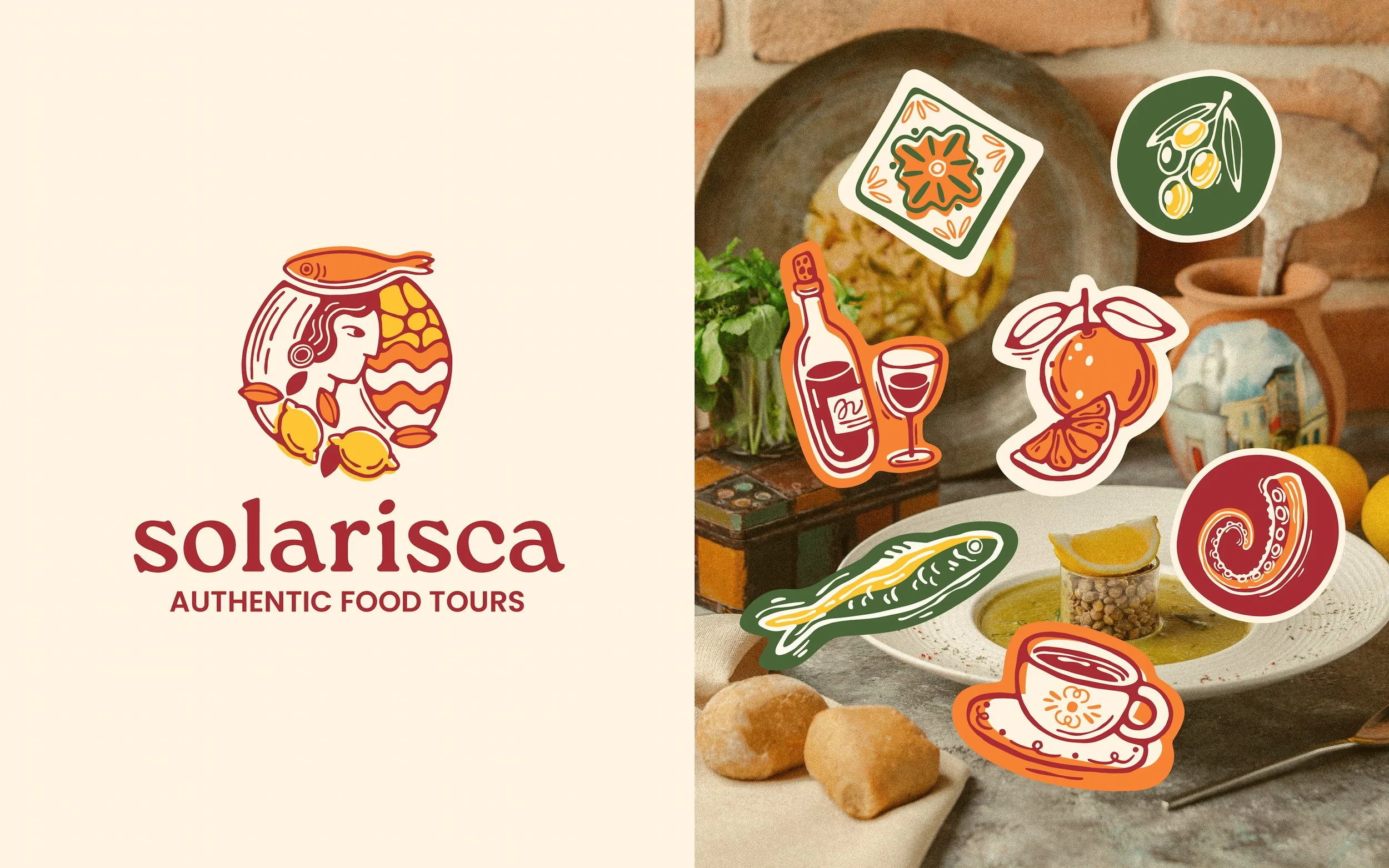
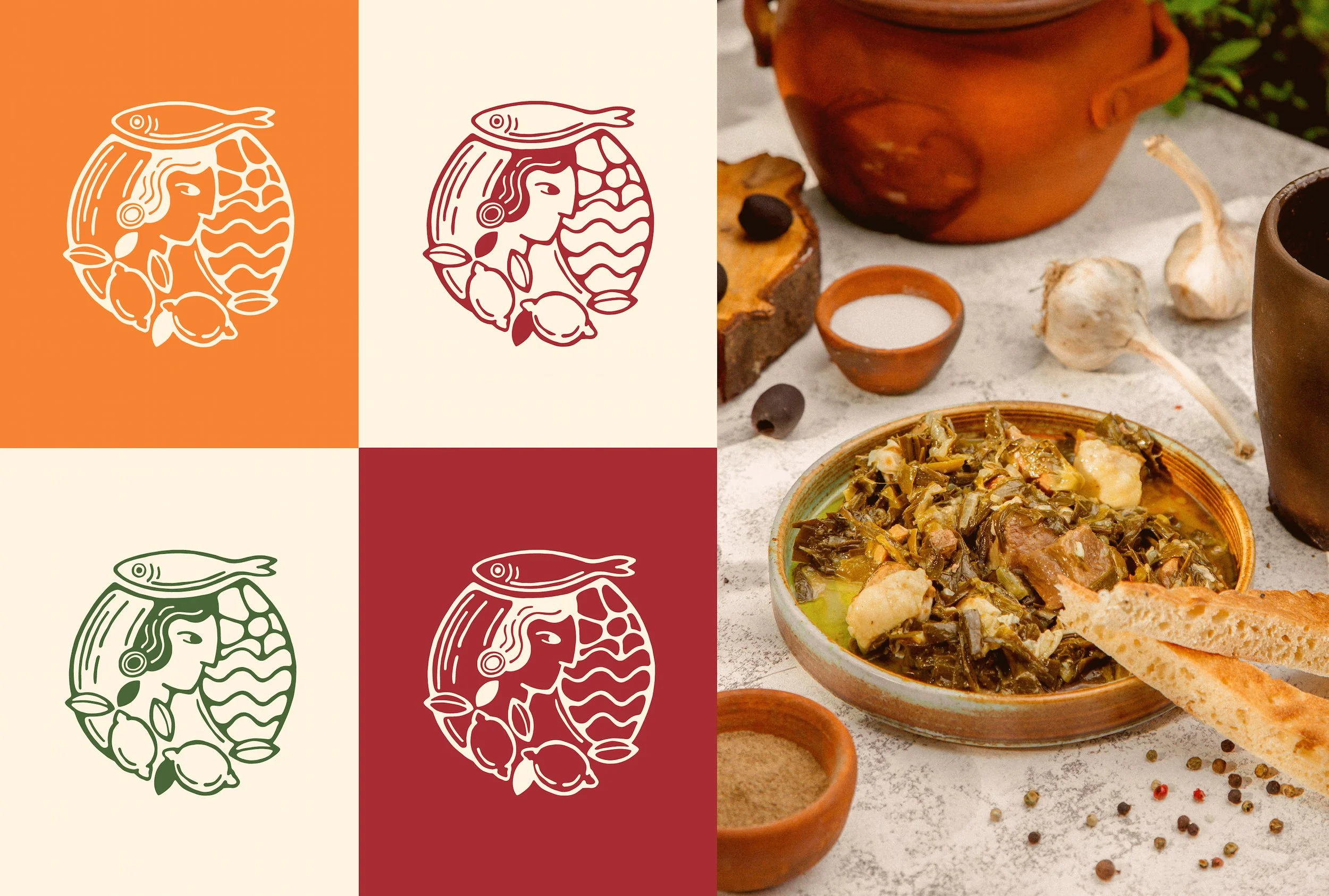
The new brand identity is built around symbols that encapsulate the region’s culture
A handcrafted visual system features an illustrative logo and graphic elements inspired by traditional Portuguese pottery and regional products, ensuring a warm, earthy aesthetic that aligns with Solarisca’s values.
The branding system is designed for seamless application across merchandise and social media, ensuring a cohesive and recognizable identity.


Like this work?
Let’s chat about how we can make something special for your project!