
Ancestral Butters - Jar Label Design
Label design for a new line of almond butters infused with adaptogens. The goal was to create a modern and youthful visual language that would stand out on the shelf, while staying true to the brand’s core value - simplicity. Each butter contains only three clean ingredients, and the design needed to reflect this purity in a clear and approachable way.
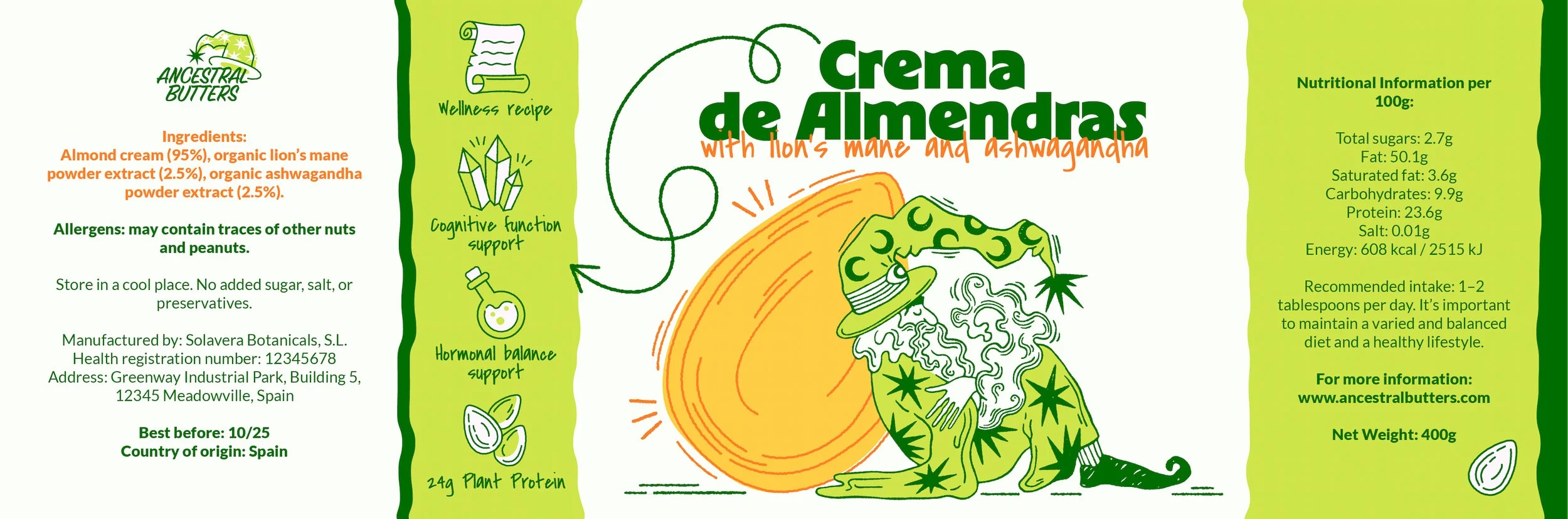
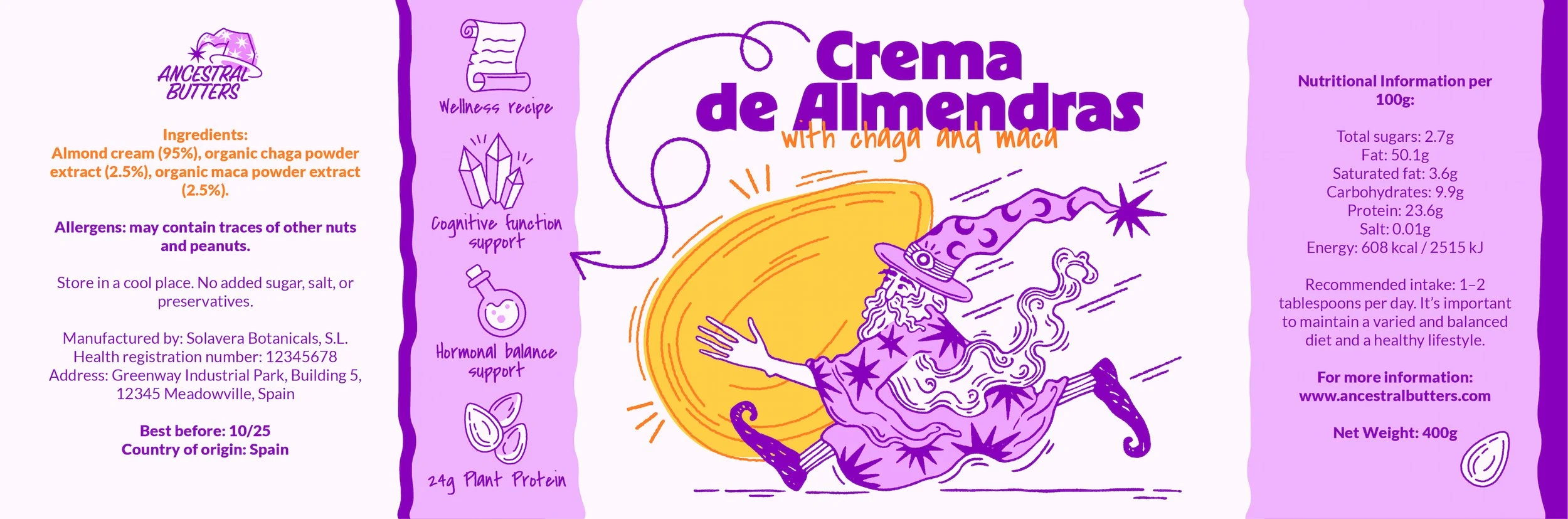
The name Ancestral Butters refers to ancient, time-honored recipes brought into the modern world. Building on this idea, I developed a wizard mascot - a symbol of ancestral wisdom with a playful, magical twist.
This character brings the concept of “modern magic” to life: not just biohacking, but a touch of wonder.

For the two main product lines - almond butter with chaga & maca (energizing), and almond butter with ashwagandha & lion’s mane (calming) - I illustrated two versions of the wizard: one active and dynamic, the other relaxed and dreamy, each reflecting the adaptogenic properties inside the jar.
The label layout balances playfulness and clarity. A benefits section on the left highlights key product advantages - each represented by custom-designed icons with a subtle magical twist, reinforcing the brand’s whimsical tone. Carefully selected typefaces combine bold, modern letterforms with friendly, script-style curves, helping to communicate both energy and approachability. The result is a clean and engaging look that captures attention while remaining easy to navigate.


In addition to the packaging, I created a set of brand illustrations featuring the mascot for use across the website, merchandise, and social media - building a strong, coherent visual universe around the product.


Like this work?
Let’s chat about how we can make something special for your project!