
GRID is an urban coffee shop and roastery built on one simple idea: great coffee for great people. No overcomplication - just a place to meet, work, or grab your favorite drink before the day starts.
The name GRID reflects both the structure of the city and the invisible threads that connect people - a map, a network, a point of belonging.
GRID - Visual Identity for a Coffee Shop

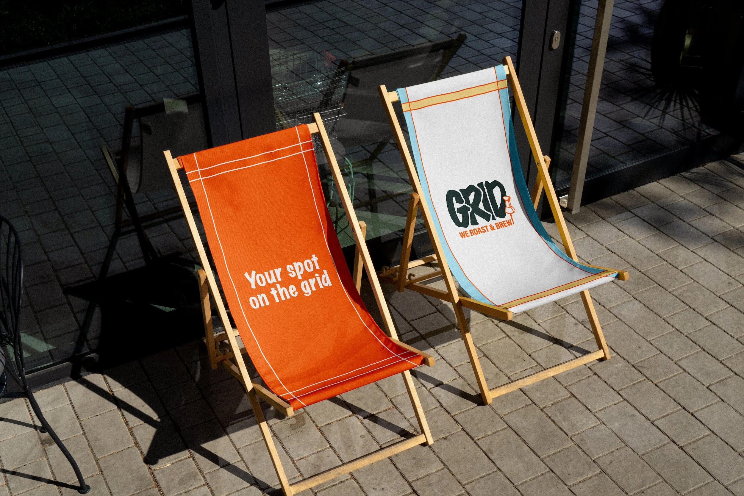
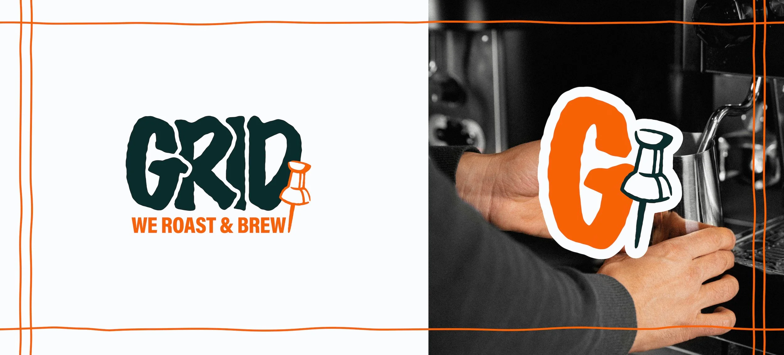
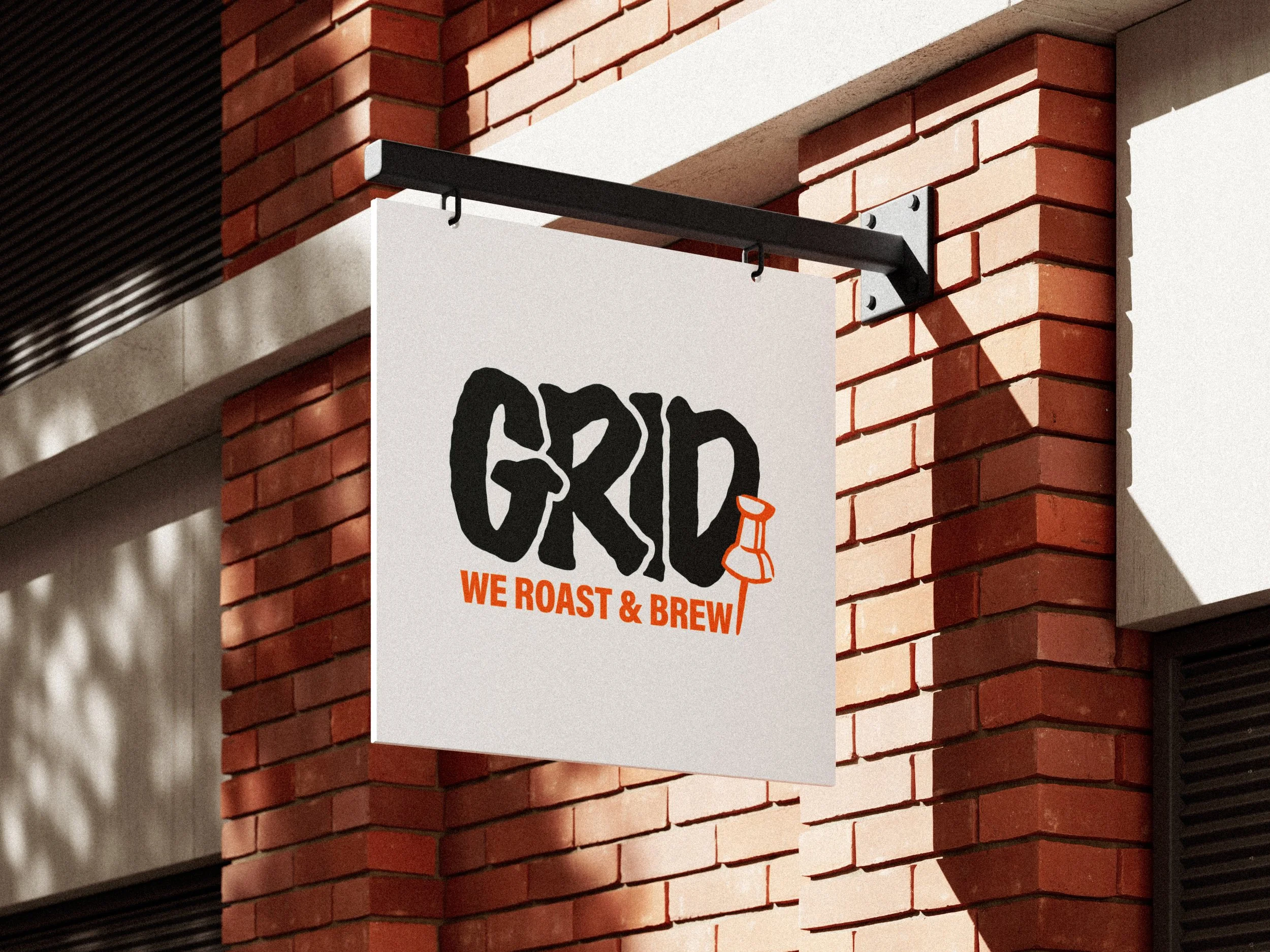
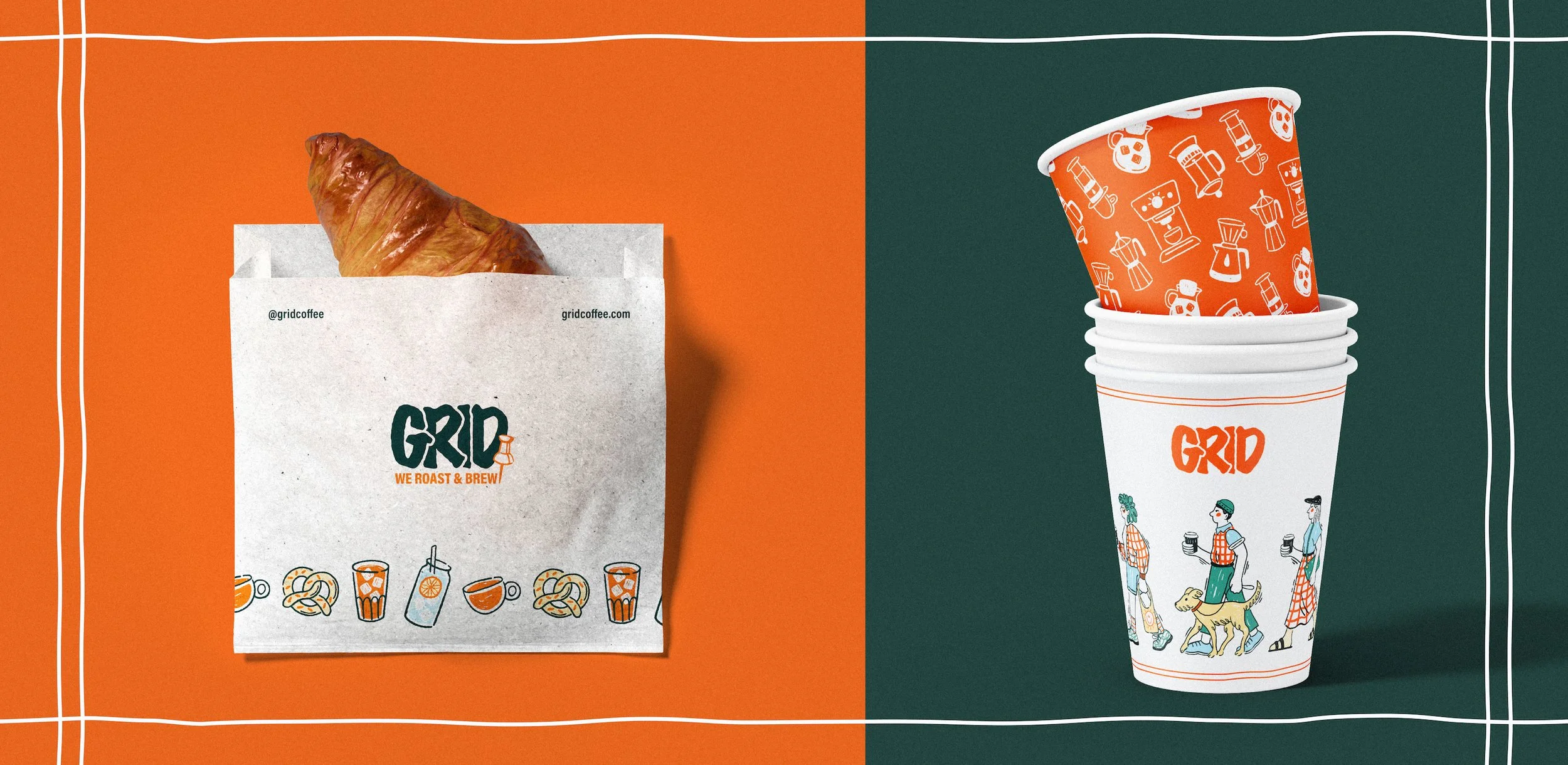
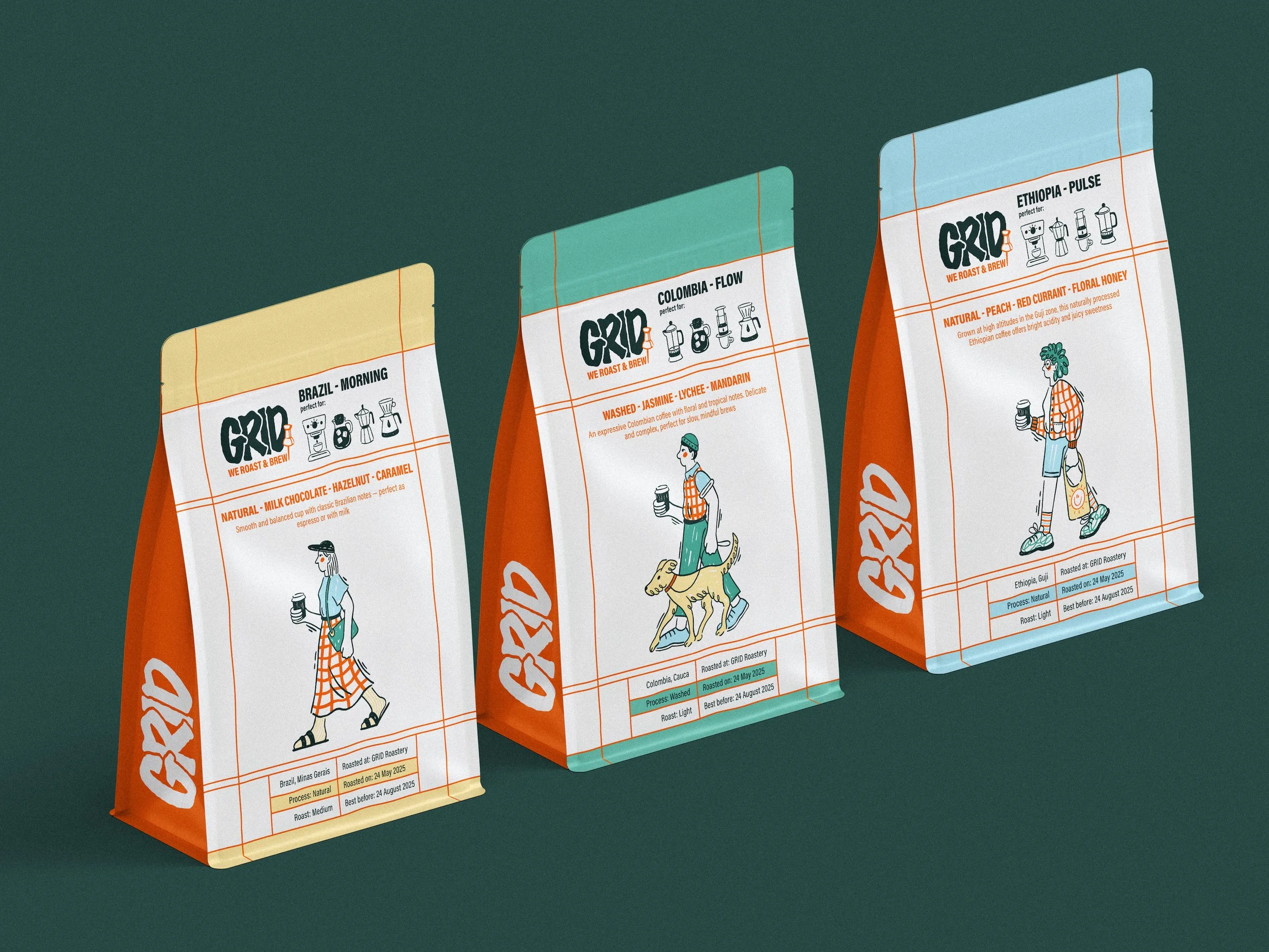
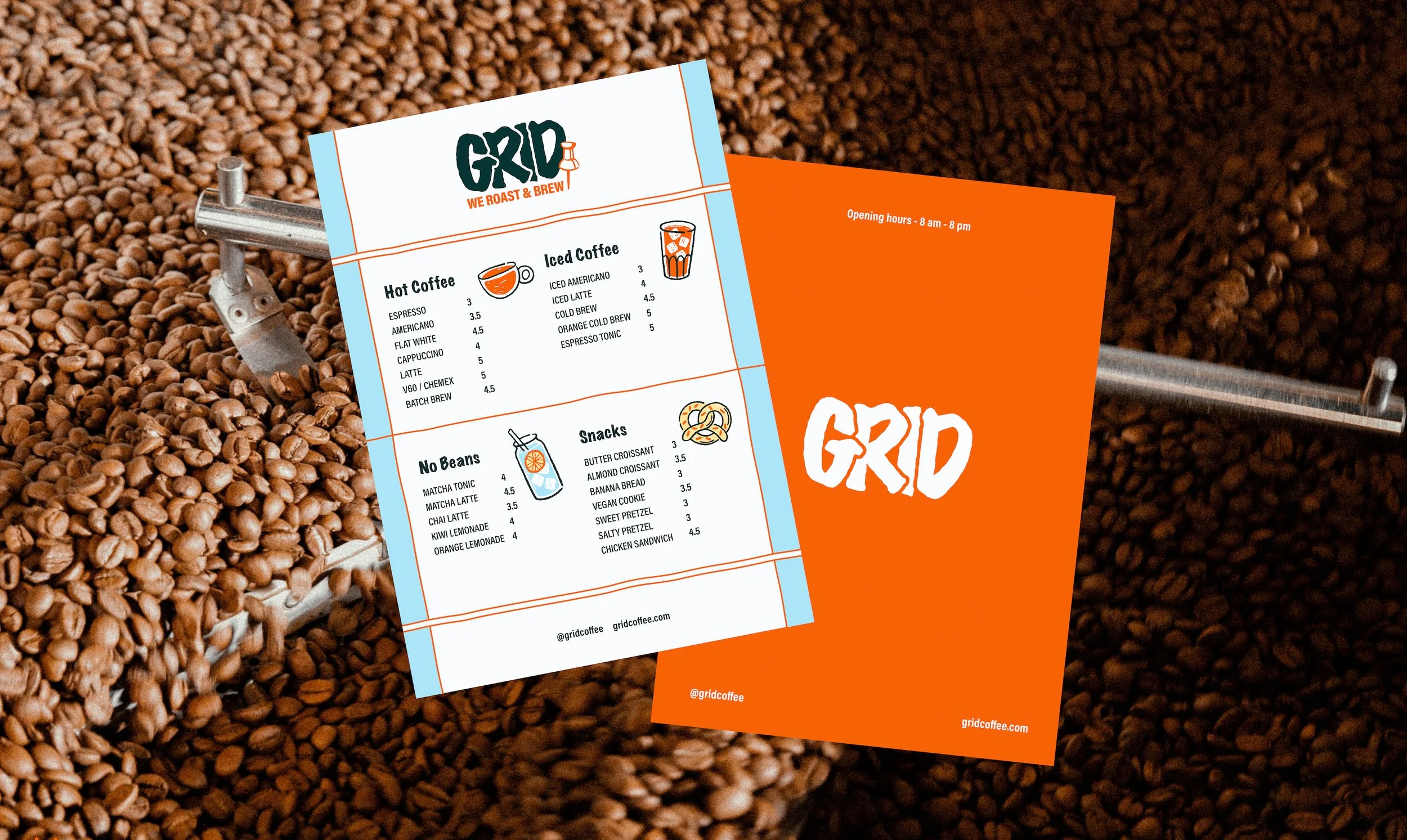
The visual identity is built on clean typography with a minimal, bold logo, a color palette featuring a standout urban orange, hand-drawn illustrations, and, of course, subtle grid elements that tie everything together. Special attention was given to coffee packaging - one of the core brand touchpoints.
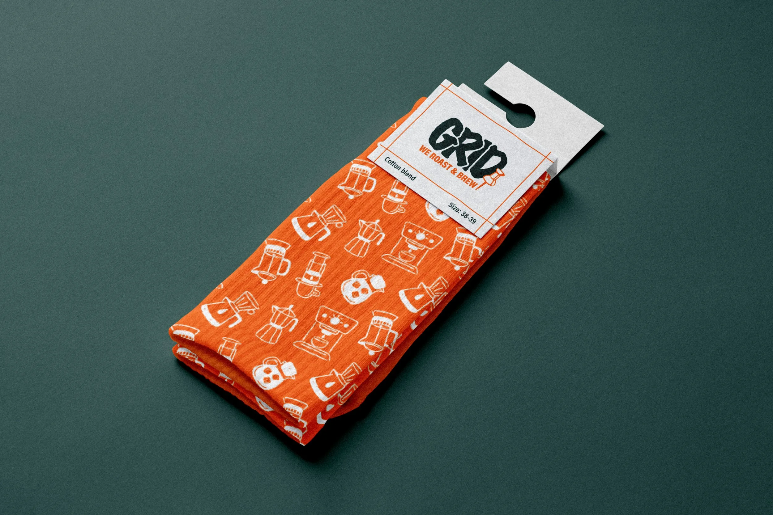
The system is scalable, expressive, and easy to adapt across merchandise, signage, print, and digital.


Like this work?
Let’s chat about how we can make something special for your project!